Coursework Deep Dive: What Actually Predicts a Whiff
Everything else on this site runs through a live pipeline: a Cloud Run Job pulls fresh data every day, loads it into BigQuery, and the posts query that table directly. This one is different, and worth flagging as different. It’s a project from GRAD 505 (Foundations in Data Science) in Purdue’s MS in Data Science program, built on a static Kaggle dataset rather than the site’s own Statcast pipeline: pitch-level data for every MLB regular-season game from 2015 through 2018, about 2.87 million pitches. No live queries here, just the analysis, with the full code, report, and slide deck linked at the bottom.
It’s included in Featured Research because the bar for that section is rigor, not whether the data happens to be live. This project ran three formal hypothesis tests, a linear regression, and a one-way ANOVA with post-hoc comparisons, and landed on a finding worth stating plainly: almost everything came back statistically significant, and almost none of it was large.
Three research questions
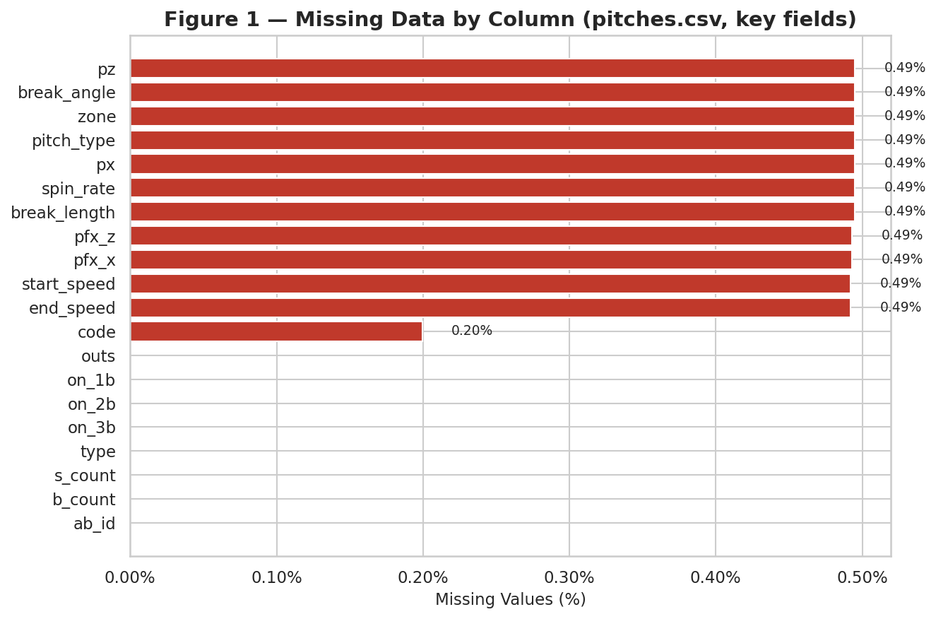
The first deliverable checked the data for major quality problems before any modeling started, a missing-values audit across all five joined tables, shown below by column. Nothing in that audit compromised any of the three analyses that follow.
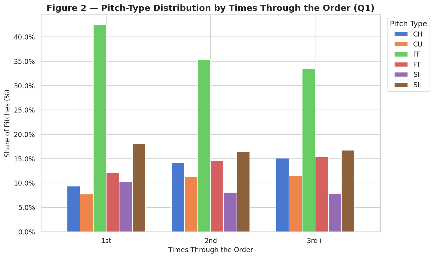
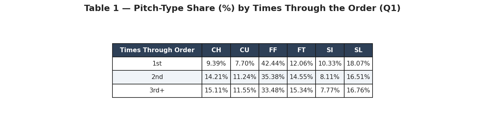
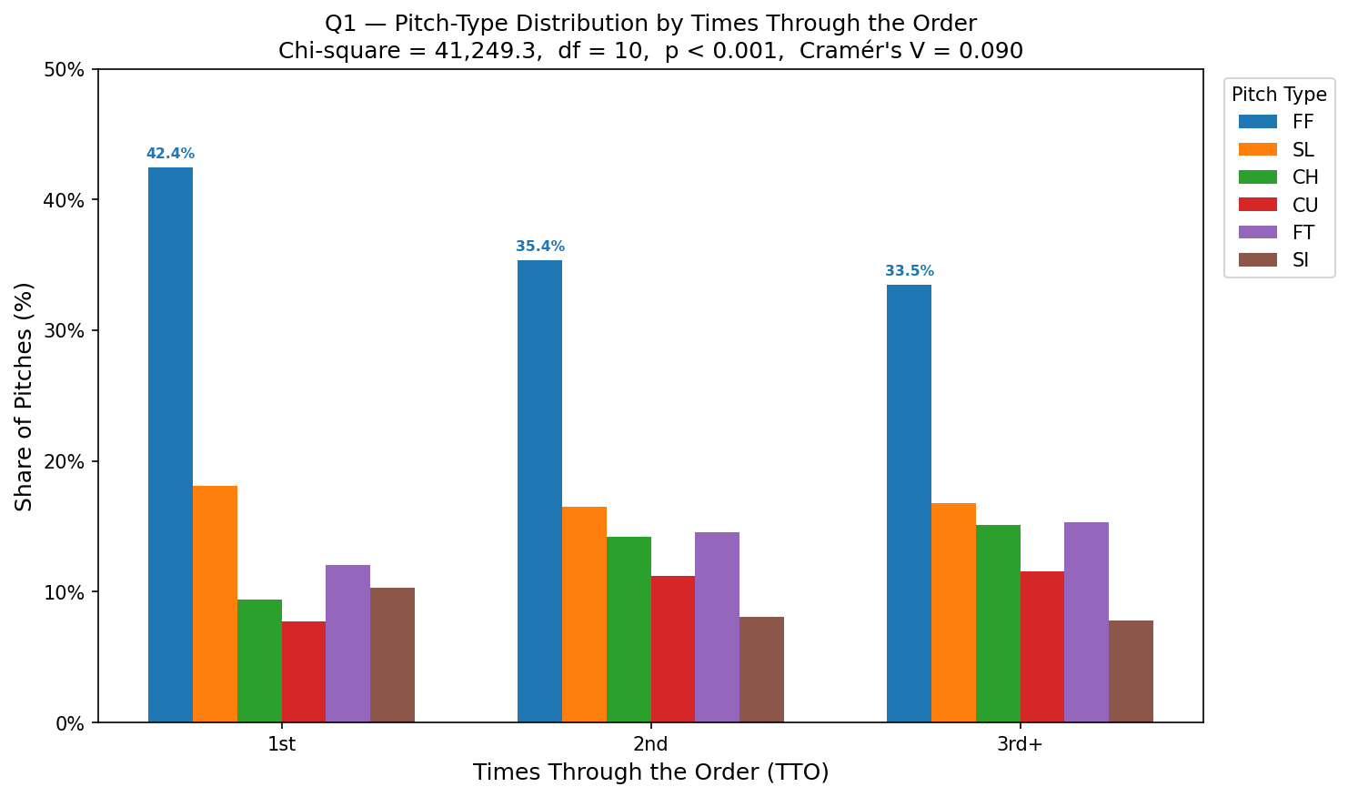
Does a pitcher’s pitch mix change the third time through the order? A chi-square test of independence on pitch type versus times through the order came back significant (chi-square = 41,249.35, df = 10, p < 0.001), but Cramer’s V was 0.0895, a small effect by any standard cutoff. Pitchers do shift their mix as a game goes on, just not by much.
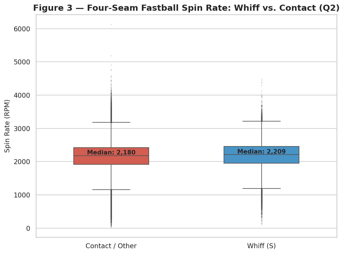
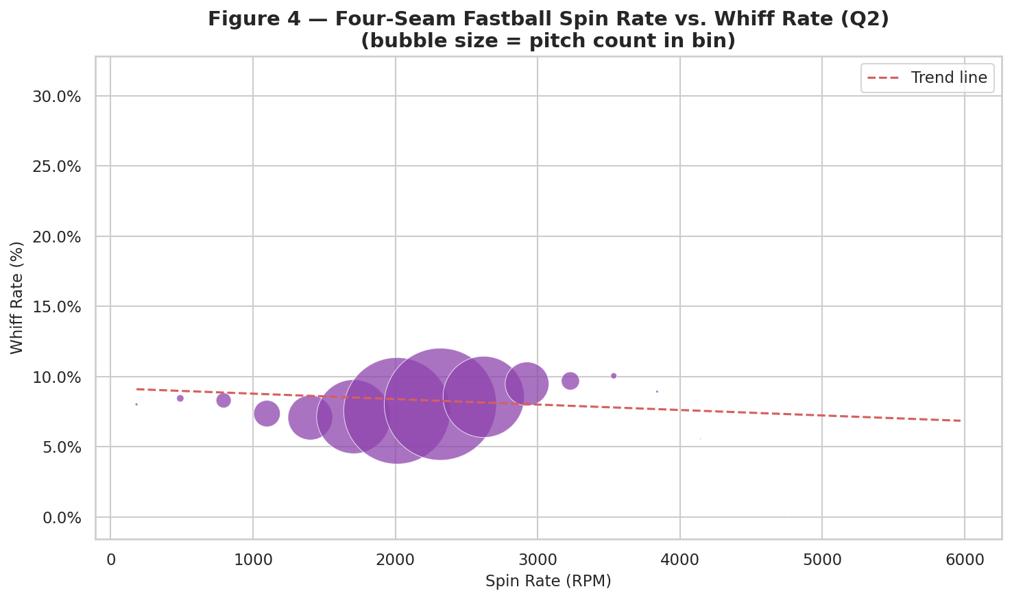
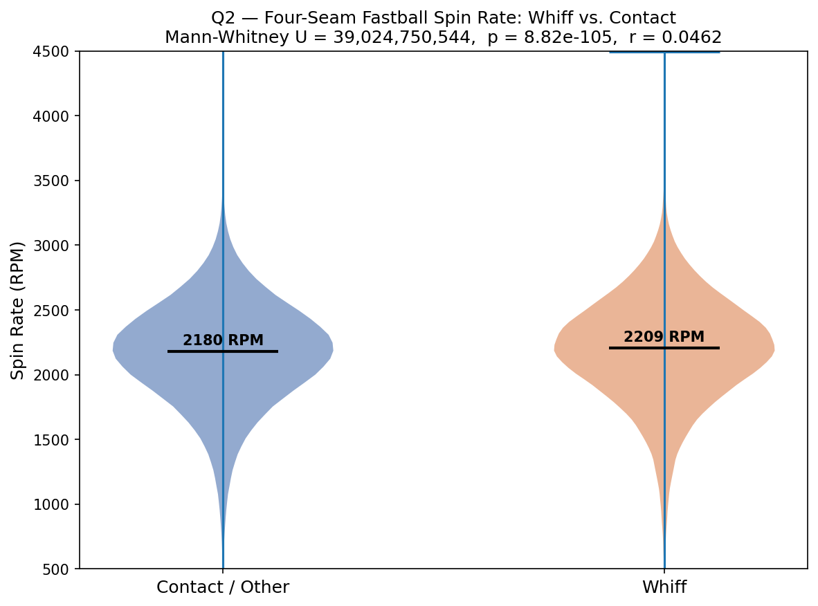
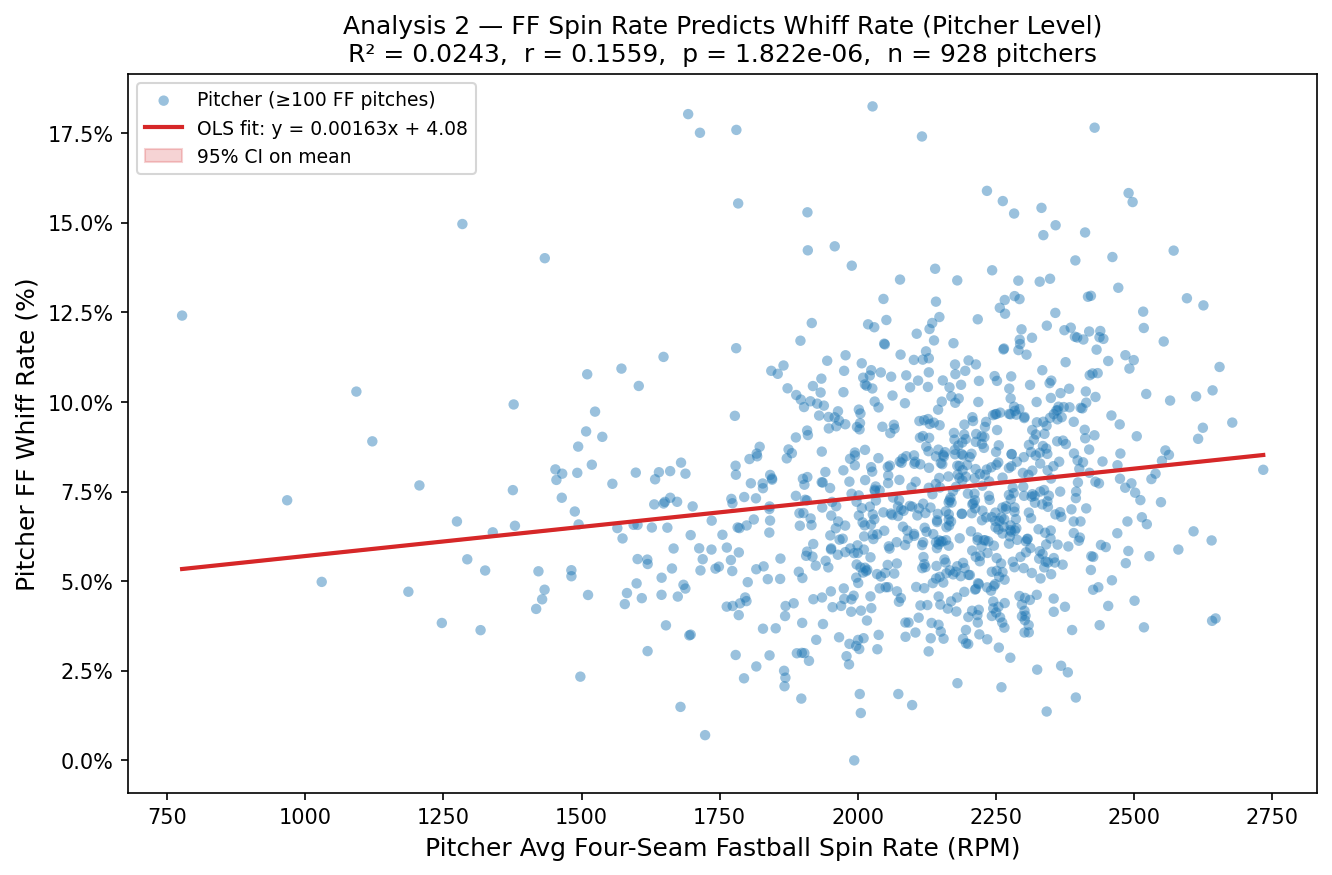
Does spin rate on a four-seam fastball predict a whiff? A one-sided Mann-Whitney U test found whiffs came on pitches with a higher median spin rate (2,209.1 RPM) than pitches put in play (2,179.7 RPM), and the difference was significant (p = 8.82e-105). The rank-biserial effect size was 0.0462, again small. A follow-up OLS regression of whiff rate on average four-seam spin rate (n = 928 pitchers with at least 100 four-seamers) found a significant positive slope (0.000016 per RPM, p = 1.82e-06), but the model explained just 2.4% of the variance in whiff rate (R-squared = 0.0243). Spin rate matters, but it’s one input among many.
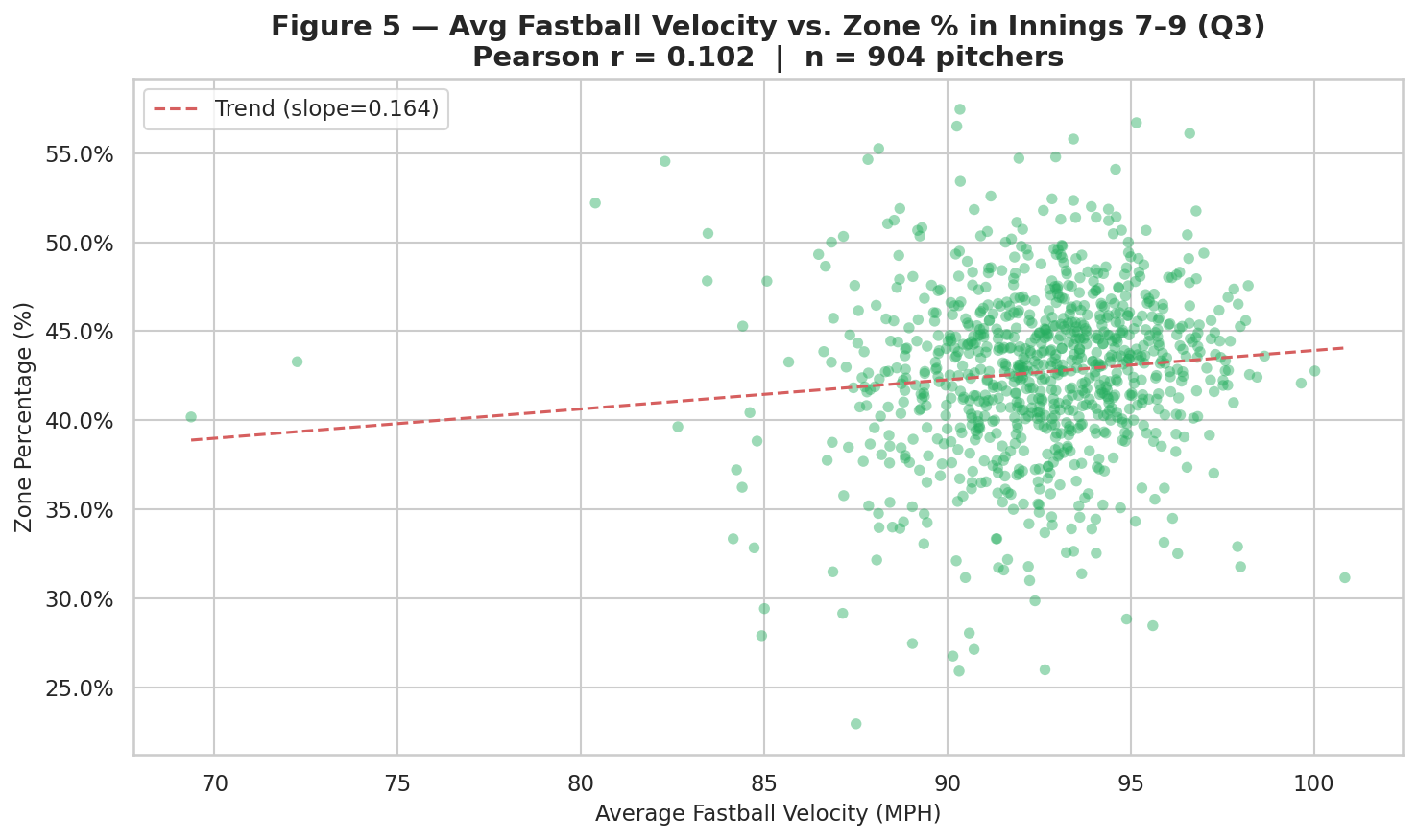
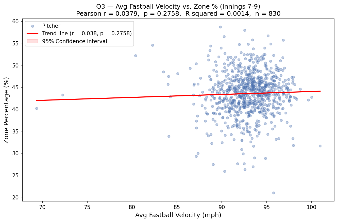
Does average fastball velocity predict strike-zone rate in high-leverage innings (7th-9th)? This is the one question where the data didn’t clear the bar. Pearson correlation between average four-seam velocity and zone percentage came back essentially flat (r = 0.0379, p = 0.276, n = 830 pitchers with at least 50 late-inning fastballs), so this test failed to reject the null. A secondary Spearman rank correlation was technically significant (rho = 0.0727, p = 0.036), but at that size it’s not a finding to build anything on.
The velocity creep that is real, and tiny
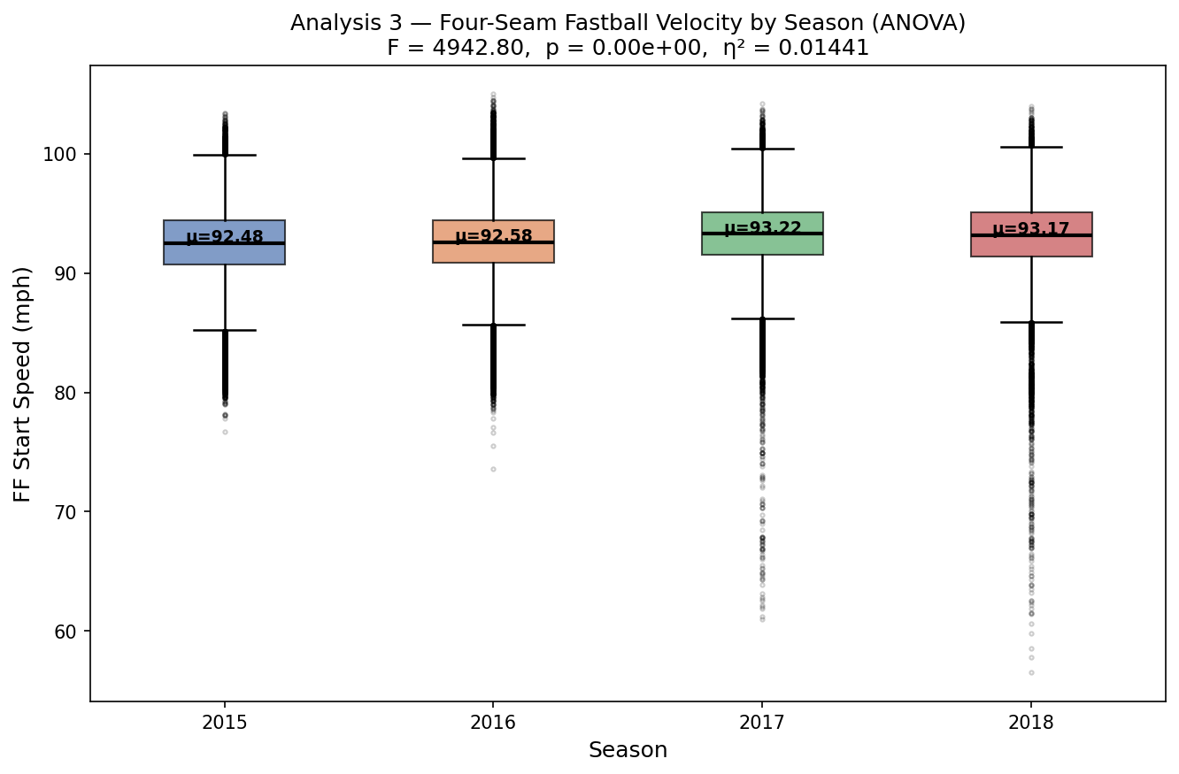
The final analysis ran a one-way ANOVA on four-seam fastball velocity across all four seasons in the dataset:
| Season | n | Mean (mph) | Std |
|---|---|---|---|
| 2015 | 249,755 | 92.48 | 2.80 |
| 2016 | 257,649 | 92.58 | 2.75 |
| 2017 | 253,387 | 93.22 | 2.79 |
| 2018 | 254,086 | 93.17 | 2.75 |
The ANOVA rejected the null outright (F = 4,942.80, p < 0.001), and every pairwise comparison came back significant under a Bonferroni correction, including 2017 versus 2018, a 0.057 mph difference. League-average fastball velocity really did climb across this window, about three quarters of a mile per hour from 2015 to 2017 before leveling off. It’s a real trend. It’s also a small one, and the effect size confirms it: eta squared came out to 0.0144, meaning season explains under 2% of the variation in any single pitch’s velocity.
Whiff rate by pitch type
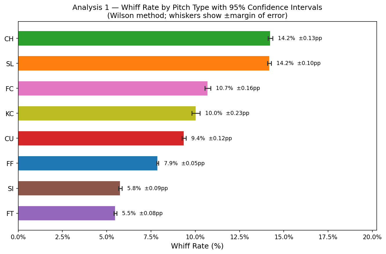
One more result worth surfacing on its own, a 95% Wilson confidence interval on whiff rate for each pitch type across the full 2.87 million pitches:
| Pitch | Whiff rate | 95% CI |
|---|---|---|
| Changeup (CH) | 14.2% | 14.1% - 14.4% |
| Slider (SL) | 14.2% | 14.1% - 14.3% |
| Cutter (FC) | 10.7% | 10.6% - 10.9% |
| Knuckle-curve (KC) | 10.0% | 9.8% - 10.3% |
| Curveball (CU) | 9.4% | 9.2% - 9.5% |
| Four-seam (FF) | 7.9% | 7.8% - 7.9% |
| Sinker (SI) | 5.8% | 5.7% - 5.9% |
| Two-seam (FT) | 5.5% | 5.4% - 5.6% |
At this sample size the confidence intervals are tight enough that every pitch type is distinguishable from every other, changeups and sliders generate whiffs at roughly the same rate and both clear fastballs by nearly double.
Why this belongs next to the pipeline posts
The throughline across all five analyses is the same: with millions of pitches, almost any real difference clears the p < 0.05 bar, so the question that actually matters is how big the effect is, not whether it exists. That’s a distinction worth being explicit about on a site built around real data, and it’s the main thing this project set out to demonstrate.
Full write-up, slide deck, and all analysis code:
Unlike the pipeline-driven posts on this site, this one isn’t frozen against a live BigQuery table, there’s no BigQuery table behind it. The numbers above are transcribed from the project’s own output files (OUTPUTS/hypothesis_results.txt and OUTPUTS/final_project_results.txt in the repo linked above), generated from a static Kaggle dataset rather than this site’s own pipeline.